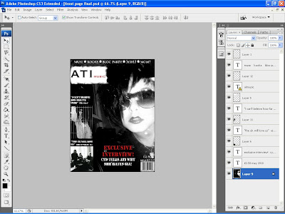
Stage 1 - I chose which photo I wanted to use for my front cover. I decided not to use the magnetic lasso tool so I could use another background and stuck with the original photo background. I did this because I knew that the photo was black and white and this would making cutting out my model difficult. I also knew that the dullness of the black to the left of my model would be covered with stories and photos. I created a white box for my masthead and used the smuge tool to create an edgy effect on the outline of the box. I then chose the colours for my masthead and set the colour theme for the rest of the magazine. I used red as I felt it had a nice effect on the white background in the smaller writing and if I had chosen to use all black and white text my page would have been boring.

Stage 2 - At the top of the page I used a banner once again sticking to the colour scheme of white writing on the black background. This banner also informed the viewer what bands would feature later in the magazine. I found the stars that I used inbetween the band names from google images and copied and pasted them onto my front page and merged the layers. I also added my barcode to the bottom right hand corner.
 Stage 3 - I filled the left hand side with 2 stories that would feature in the magazine. Above these pictures I added quotes in relation to the stories. This allows the viewer to have an insight into the magazine just my glancing at the cover.
Stage 4 - I then added the main headline on to my model. I located it in the middle of the page so it immediatly draws the eye. Being in red this also creates an eye catching effect. The red is the same red used in the masthead to continue my colour theme. The headline is also written in a different font called Stencil and I think it contrasts nicely with the masthead font and helps to add a little variety to the page. I also added the date and the price in the smallest writing on the page above the barcode to create a professional finish. This make the magazine look realistic as many magazines want the price to be the last thing you look at before buying the magazine.

No comments:
Post a Comment